- Client
- Maison Naru
- Industry
- Tableware & Ceramics
- Service
- Brand Identity Kit
- Scope
- Naming · Logo Design · Visual Identity · Colour System · Typography · Brand Applications
Maison Naru is a boutique porcelain tableware brand inspired by handcrafted ceramics, slow living and the warmth of everyday rituals.
The identity was designed to balance ancestral warmth with contemporary restraint, creating a visual system that feels tactile, calm and premium across product, packaging and digital applications.
Form, warmth and ritual
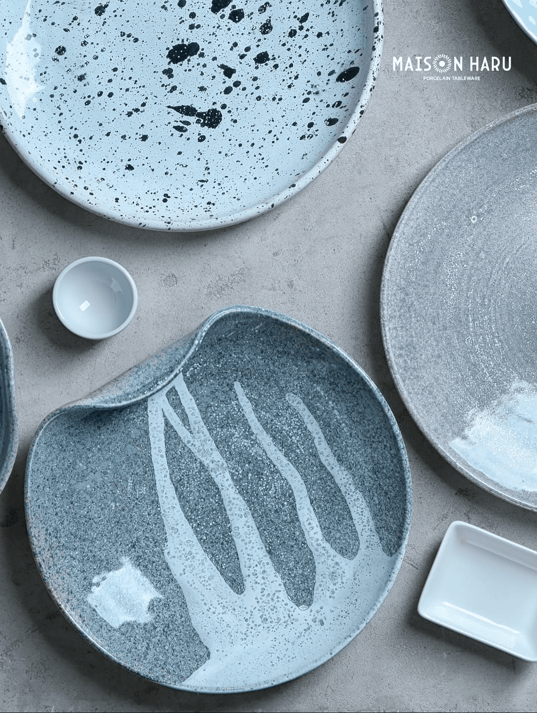
The creative direction was built around the relationship between natural material, morning light and the quiet rituals associated with the home.
Soft earth tones, restrained typography and a radiating sun symbol were combined to create an identity that feels crafted rather than manufactured.
A mark shaped by warmth.
The sun-inspired symbol replaces the central letterform, creating a distinctive mark that connects the brand name to warmth, craft and renewal.
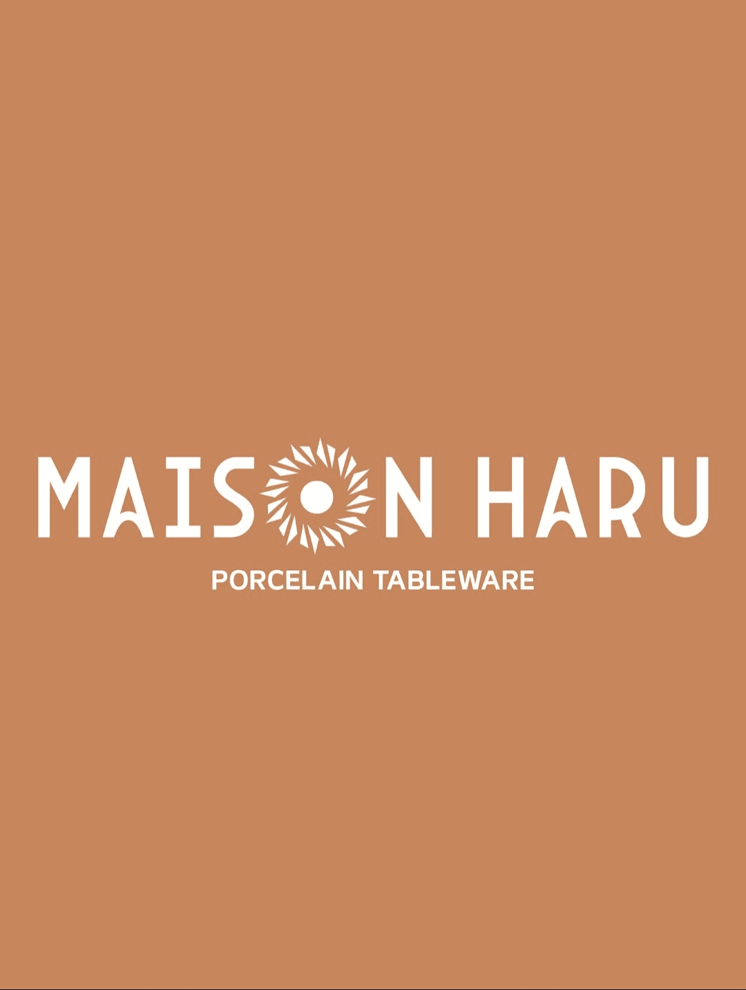
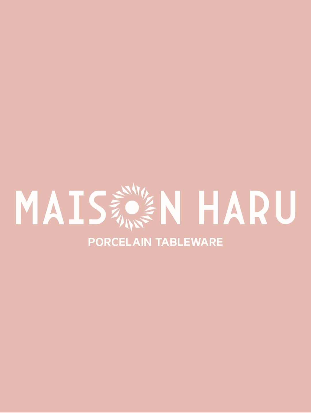
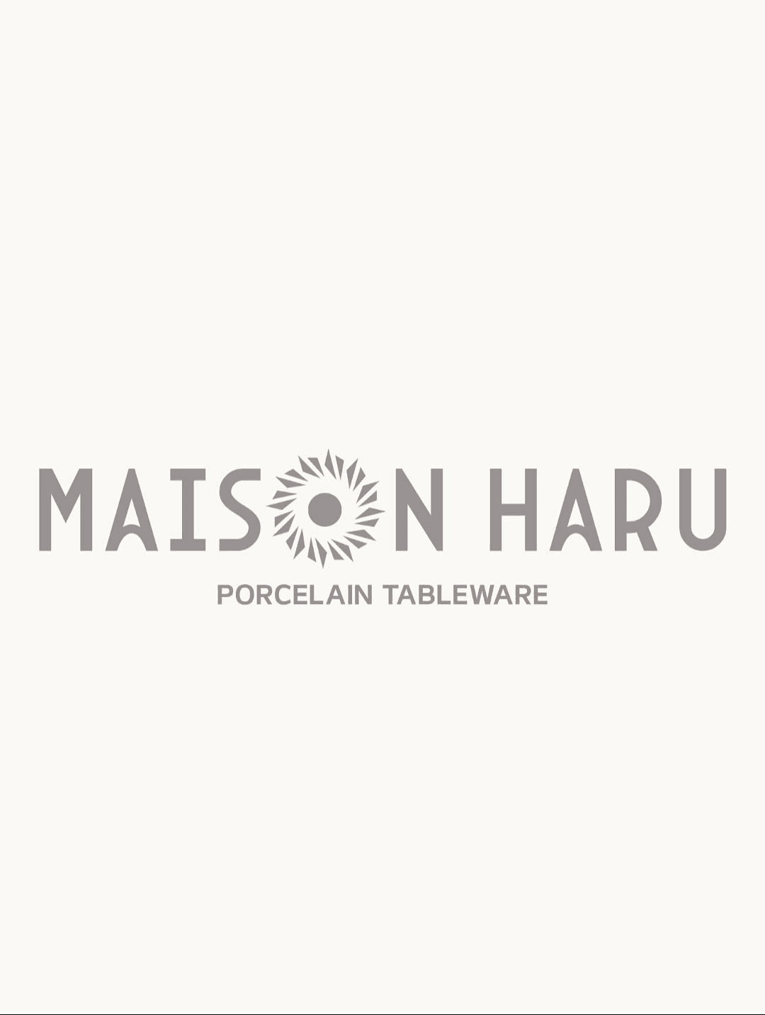
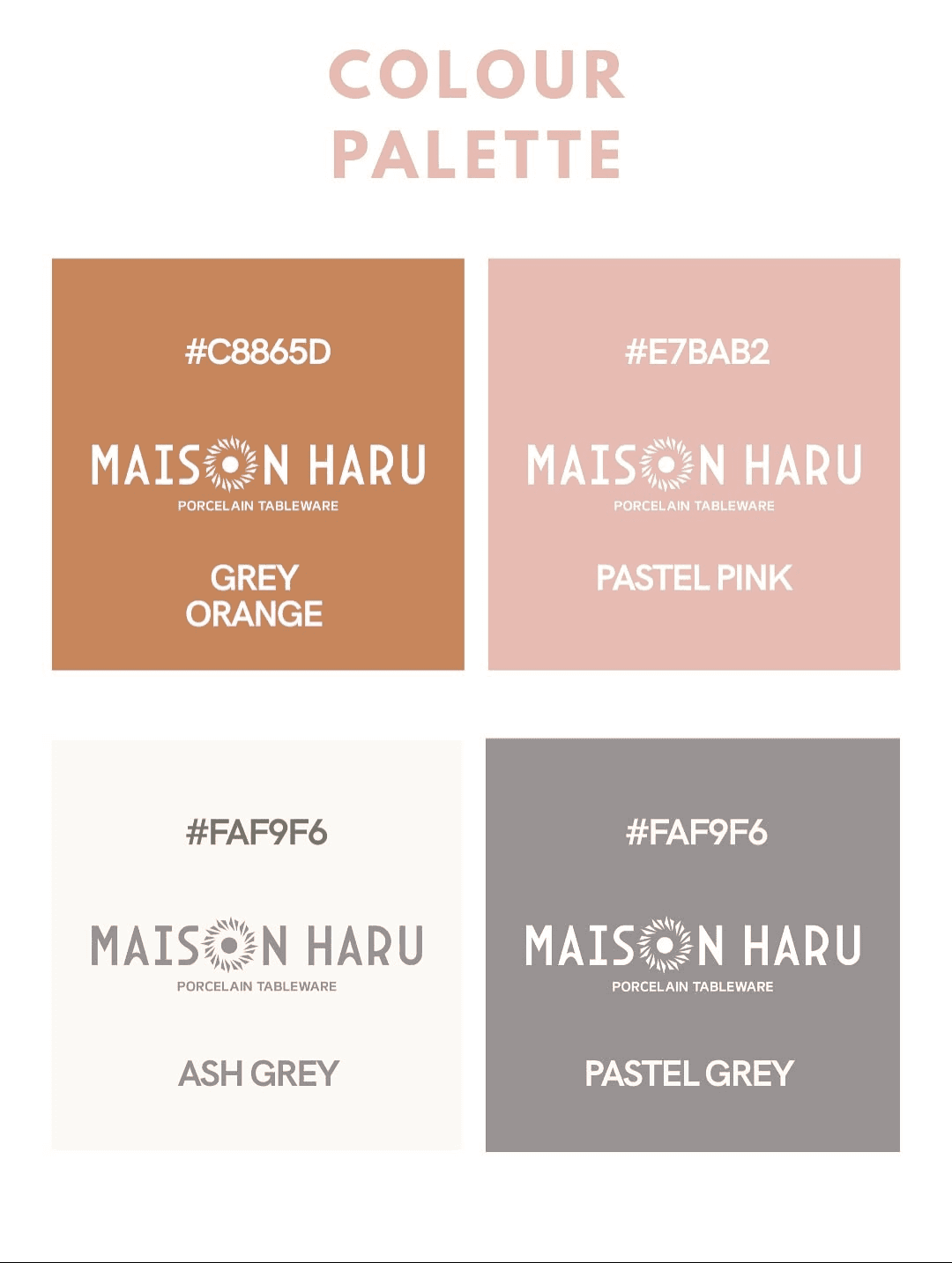
Earth, porcelain and quiet contrast.
- Primary Typeface
- Arcane Nine
- Secondary Typeface
- Handcreate
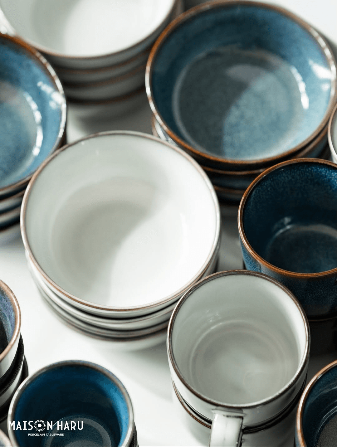
Made for considered, everyday use.
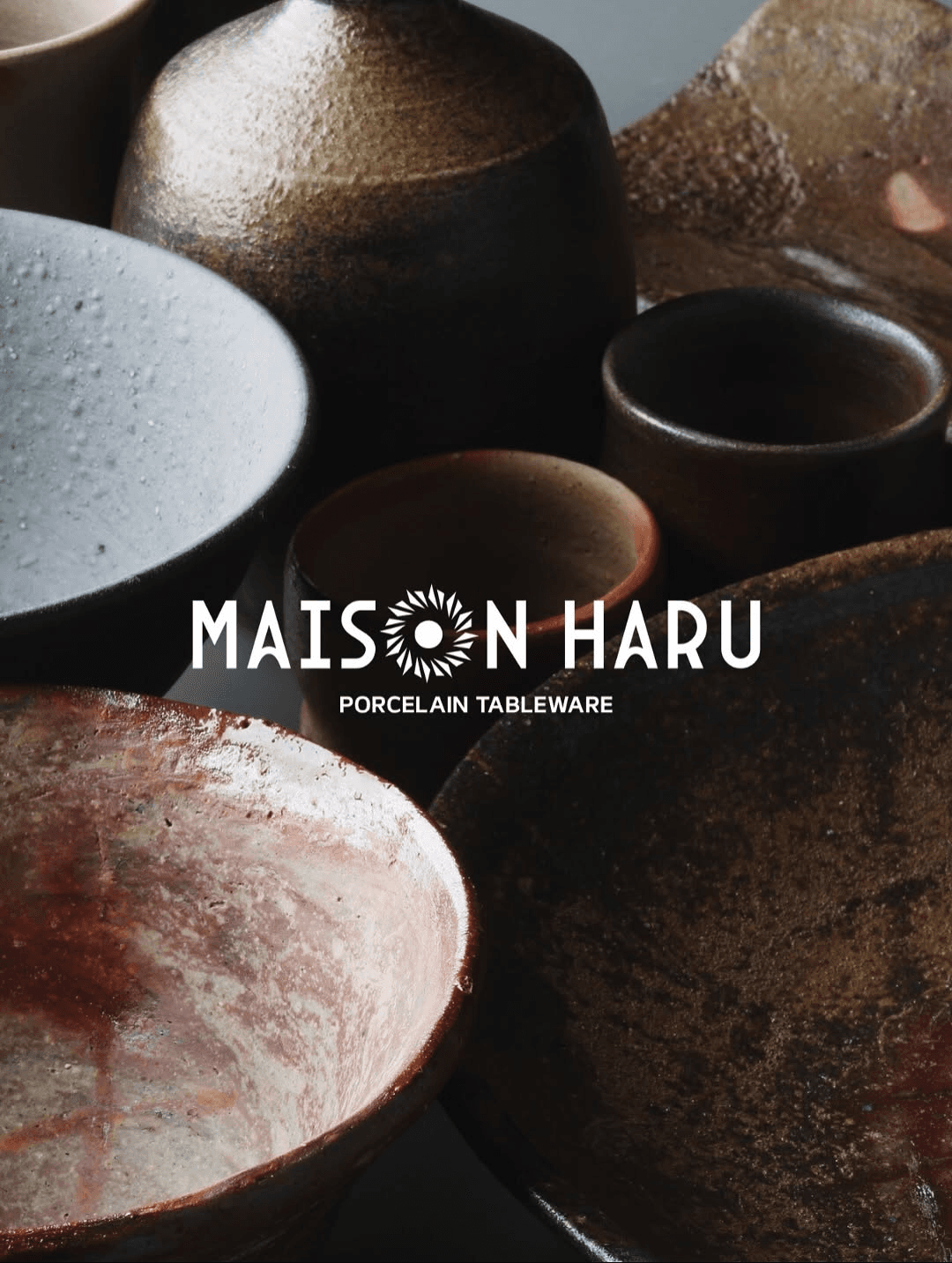
The complete identity
A flexible visual system designed to move between refined product presentation, warm lifestyle storytelling and everyday brand communication.
A contemporary identity shaped to make everyday rituals feel intentional.